
In today’s digital world, more than 70% of website traffic comes from mobile devices, yet many businesses still prioritize desktop design. This mismatch leads to slow load times, awkward layouts, and frustrated users all of which can cost you leads and conversions.
A mobile-first website ensures your visitors get a seamless, fast, and engaging experience no matter what device they use. With Google now ranking sites based on mobile performance, it’s no longer just about design, it’s about visibility, trust, and growth.
In this blog, we’ll walk you through a simple 5-step test to check if your website is truly mobile-first and what you can do to improve it. Because in 2025, your mobile experience defines your brand experience.
What Does “Mobile-First” Really Mean?
A mobile-first website is designed and optimized for smartphones before being adapted for larger screens. Instead of shrinking a desktop site to fit mobile, it starts with the mobile user’s needs: fast load times, clean layouts, easy navigation, and clear content flow.
This approach ensures your site performs flawlessly on smaller screens, where most users now browse. It’s different from “mobile-friendly,” which simply adjusts an existing desktop design.
With Google’s mobile-first indexing, your site’s mobile version is the one that gets evaluated for ranking. That means a mobile-first strategy isn’t just good UX, it’s essential for better SEO, user engagement, and conversions.
If your site isn’t optimized yet, consider rebuilding it with mobile-first website development to deliver a faster, more engaging mobile experience.
The 5-Step Mobile-First Website Test
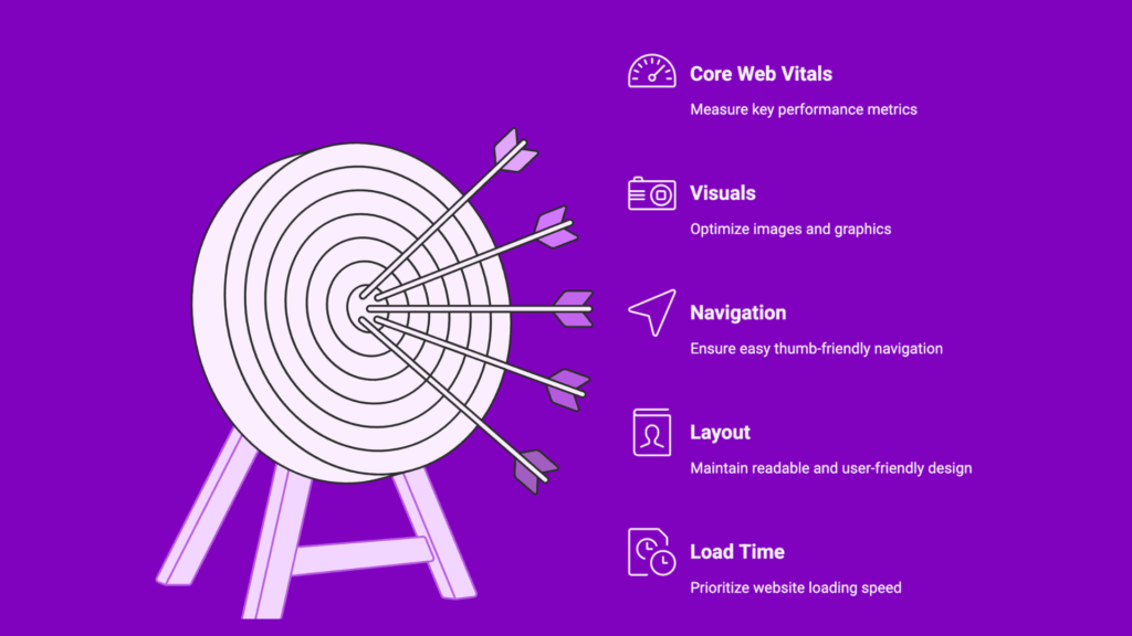
Wondering if your website is truly mobile-first? Here’s a quick 5-step test to find out how well your site performs on mobile devices.
Step 1: Load Time, Speed is Everything
Your website should load in under 3 seconds on mobile data. Slow loading leads to higher bounce rates and lost visitors. Use tools like Google PageSpeed Insights or GTmetrix to check performance, and improve speed by compressing images, enabling caching, and minimizing scripts.
Step 2: Layout, Keep It Effortless to Read
A mobile-first layout adapts seamlessly to any screen size. Ensure your text is legible, your content fits without side-scrolling, and your design uses a responsive grid system. Test your site across different devices to confirm a consistent viewing experience.
Step 3: Navigation, Make It Thumb-Friendly
Menus, buttons, and CTAs should be easy to tap with one hand. Use sticky menus, large touch targets, and clear icons to improve usability. A simple and intuitive navigation structure keeps users engaged and encourages conversions.
Step 4: Visuals, Optimize for Mobile Screens
High-resolution images can slow down mobile performance. Use compressed formats like WebP, scale visuals properly, and implement lazy loading for faster rendering. Avoiding cluttered graphics and maintaining simplicity improves both aesthetics and speed.
Step 5: Core Web Vitals, Measure What Matters
Google’s Core Web Vitals CLS (visual stability), LCP (loading speed), and INP (interactivity) define the quality of mobile user experience. Check your scores using Lighthouse or Search Console, and aim for green ratings to boost both SEO performance and user satisfaction.
Why a Poor Mobile Experience Hurts Your Business
A poor mobile experience can silently damage your brand and bottom line. When your site loads slowly or displays awkwardly on smartphones, users leave, increasing bounce rates and decreasing conversion opportunities.
Google now prioritizes mobile usability and Core Web Vitals in its rankings, meaning a non-optimized site can lose visibility and organic traffic. Beyond SEO, a frustrating mobile journey creates a negative impression, reducing trust and repeat visits.
In today’s fast-paced digital world, users expect speed, simplicity, and seamless navigation. If your website fails to deliver, your competitors are just a tap away, ready to capture the customers you lost.
How to Make the Shift: Building a Mobile-First Strategy
Transitioning to a mobile-first strategy starts with designing for the smallest screen first and then expanding for larger ones. This ensures every element, from text to visuals looks perfect and performs smoothly on mobile devices.
Focus on responsive design frameworks like Bootstrap or Flexbox to create flexible layouts. Prioritize fast load times, clear CTAs, and thumb-friendly navigation. Compress media, use minimal code, and test frequently across multiple devices and browsers.
Adopt the principle of progressive enhancement, build core features for mobile users first, then add richer experiences for desktops. A true mobile-first approach improves user experience, SEO performance, and conversion rates, helping your business stay ahead in a mobile-dominated world.
To stay ahead, explore the latest web design trends shaping how users interact with mobile-first websites in 2025.
Pro Tip: Test, Iterate, and Stay Ahead
A mobile-first website isn’t a one-time setup, it’s an ongoing process of testing and optimization. Regularly audit your site using tools like Google Lighthouse, PageSpeed Insights, and Search Console to monitor performance, Core Web Vitals, and mobile usability.
Use real-user feedback and analytics data to identify friction points, update designs, and refine navigation. Even small improvements in speed, layout, or interactivity can significantly boost engagement and SEO rankings.
By continuously testing and iterating, you ensure your website remains fast, user-friendly, and future-ready keeping your brand ahead in an ever-evolving mobile landscape.
Conclusion: Your Mobile Experience = Your Brand Experience
In 2025, your mobile experience defines your brand. A fast, responsive, and visually clean mobile site isn’t just about convenience, it’s about credibility, engagement, and conversions.
By following the 5-step mobile-first test, you can identify performance gaps and create a smoother, more enjoyable journey for your visitors. Remember, a website that performs flawlessly on mobile builds trust and drives growth.If your current site isn’t passing the test, it’s time to revamp with a mobile-first approach.
At Infometrix Technologies, we help businesses design mobile-optimized websites that not only rank higher but also deliver results.